
Every report opens with two tabs. They show the same report in two different ways:
- The Visual tab is the overview — headline numbers, charts and summary tables.
- The Data tab is every row behind it.
If a number on the Visual tab looks surprising, the Data tab is where you go to see what it was built from.
Good to know
If your report also opens as a Google Sheet, that spreadsheet has its own Summary and Data worksheets. Those are separate from Stella's Visual and Data tabs. Throughout these guides, "Visual tab" and "Data tab" always mean the tabs inside Stella.
The Visual tab
At its fullest, the Visual tab lays your report out as a dashboard.
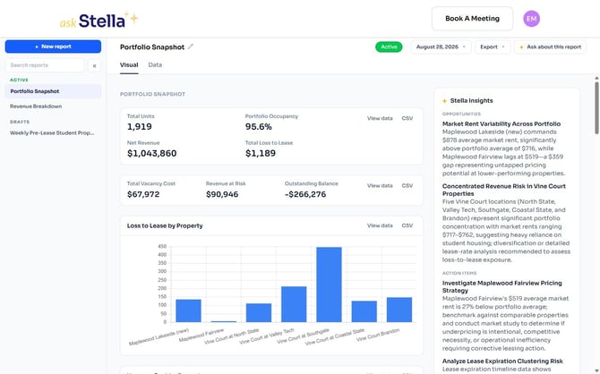
It's built from blocks, in whatever combination suits the report:
Headline figures — the numbers that answer the question at a glance.

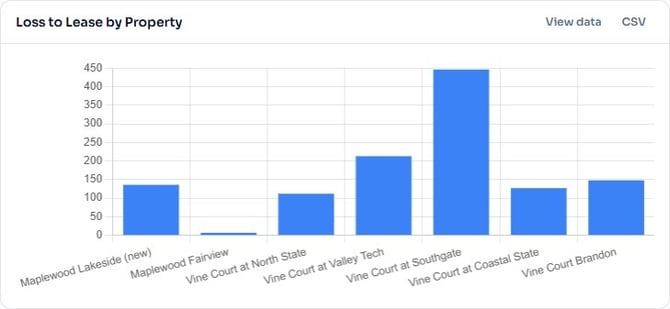
Charts — for comparing properties or following a trend over time.
Summary tables — grouped and totalled, rather than row by row.
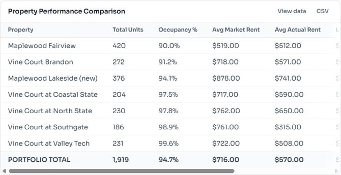
Every block has its own View data and CSV links in its top-right corner, so you can see the figures behind a single chart or table, or download just that block, without leaving the page.
Stella Insights
Alongside the report, Stella writes up what it noticed — what stands out, what's worth looking at, and what it would suggest doing about it.
On some reports this is organised into headed sections such as Opportunities and Action Items; on others it reads as a written summary. Either way it's Stella's reading of the data, not part of the data itself, so treat it as a starting point for a conversation rather than the last word.
Why your report may look simpler than the examples above
Reports don't all get the same treatment on the Visual tab, and there's nothing wrong if yours looks plainer. There are three things you might see.
A designed layout — headline figures, charts and summary tables, as pictured above. This is what a report looks like once Stella has built a layout for it.
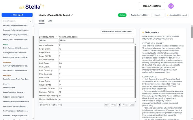
A single summary table — if Stella hasn't built a layout for that version, the Visual tab shows the report's summary as one sortable, filterable table instead, with Stella Insights beside it. Everything is still there; it's just not laid out as a dashboard.
No summary at all — some versions don't have one, and the Visual tab says so directly.
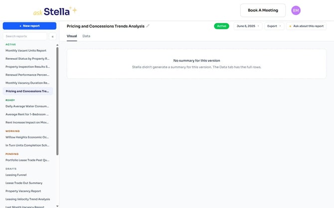
In that last case, use the Data tab — the full rows are always there.
Good to know
Because layouts are built per report, two people comparing notes on "the same report" can genuinely be looking at different-looking pages, and the same report can change appearance between versions. If you'd like your report laid out visually, click Talk To a Human to ask the Stella team — this isn't something the chat can set up for you yet.
The Data tab
The Data tab is the complete set of rows, with no grouping or summarising applied.
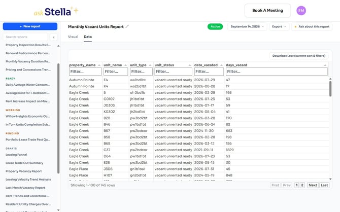
You can:
- Sort by clicking a column heading
- Filter by typing in the box under any column heading
- Page through long reports using the controls at the bottom right
- Download .csv (current sort & filters) to export exactly what you're looking at, rather than the whole report
That last one is worth remembering: filter the Data tab down to what you care about, then download, and you get just those rows.
Good to know — very large reports
The Data tab loads up to 20,000 rows. A report bigger than that is shown up to the limit, and Download .csv (current sort & filters) exports only what the tab has loaded.
For the complete data on a report that large, use Export → Download .csv from the header instead — that gives you every row.
Looking at an earlier version
The date button in the header lists every version of the report, newest first, and tells you how many there are. The one you're looking at is marked showing.
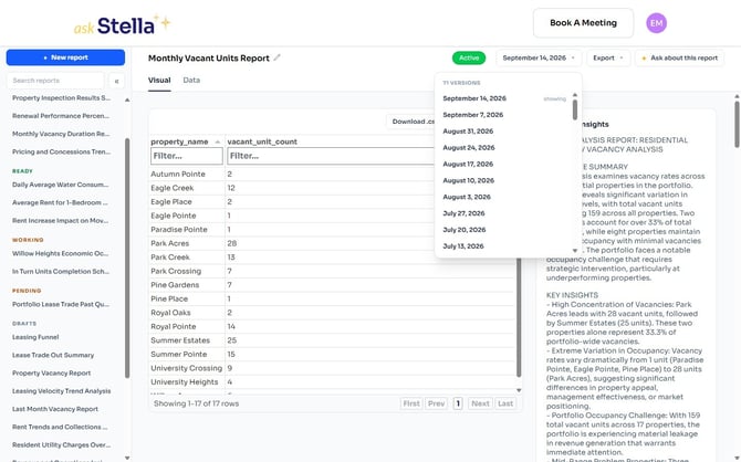
Pick any date to open that version. The Visual and Data tabs, the insights and the export options all follow the version you've selected — so an older version keeps the figures and the layout it had when it was produced, rather than being redrawn with today's.